TL;DR:
- ArcGIS is a powerful tool for visualizing weather data and integrating external sources.
- Python can be used to automate the integration of weather data into ArcGIS using a weather API.
- Different types of weather data, such as temperature, precipitation, wind speed, and cloud cover, can be visualized on ArcGIS.
- Best practices for visualizing and analyzing weather data on ArcGIS include using appropriate visualization techniques and considering scale and resolution.
- Integrating weather data with ArcGIS using Python can provide valuable insights for decision-making in various industries.
ArcGIS is a powerful tool for visualizing spatial data and has a wide range of applications in various fields, including weather forecasting and analysis.
One of the most useful features of ArcGIS is the ability to integrate external data sources to enhance the visualizations and analysis.
In particular, integrating weather data with ArcGIS can provide valuable insights into weather patterns and trends, which can inform decision-making in various industries such as agriculture, transportation, and emergency management. You can code in Python to automate the integration of weather data into ArcGIS.
By using a weather API, you can retrieve real-time or historical weather data and then integrate it with ArcGIS to create informative visualizations. This integration can provide a wealth of information, such as temperature, precipitation, wind patterns, and other weather-related variables.
Understanding Weather Data
Weather data visualization can help us understand and interpret the complex patterns of weather and climate.
Here are just some of the different types of weather data we can visualize on a map:
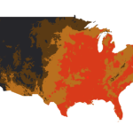
- Temperature: Temperature is one of the most fundamental weather variables, and it is often displayed using color-coded maps. These maps use a color scale to indicate the temperature range, with warm colors (such as red and orange) representing high temperatures and cool colors (such as blue and green) representing low temperatures. Contour lines can also be used to show areas with similar temperatures.
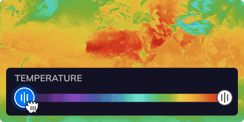
Tomorrow.io’s Weather API allows a colorful temperature range, as shown in the Tomorrow.io Weather Intelligence Platform via the Risk Map
- Precipitation: Precipitation refers to any form of water that falls from the atmosphere, including rain, snow, sleet, and hail. Precipitation maps typically show the amount of precipitation that has fallen in a particular area over a given period of time, such as the past 24 hours or the past week. These maps often use color-coded scales to indicate the precipitation intensity, with darker colors representing higher precipitation amounts.
- Wind speed: Wind speed refers to the rate at which air is moving horizontally across the Earth’s surface. Wind speed maps show the speed and direction of the wind in a particular area, often using arrows to indicate the wind direction and color scales to indicate the wind speed. Stronger winds are typically represented by longer arrows and darker colors.
- Cloud cover: Cloud cover refers to the amount of the sky that is covered by clouds. Cloud cover maps show the distribution of clouds over a particular area, often using color scales to indicate the cloud density. These maps can be used to track the movement of weather systems and to predict the likelihood of precipitation.

Visualizing Weather Data on ArcGIS
Visualizing weather data on ArcGIS offers benefits by creating visually appealing maps, charts, and animations displaying weather data patterns and trends. The real-time dynamic and animated maps enable users to identify potential risks and make informed decisions. ArcGIS’s robust capabilities make it an excellent tool for experienced developers working with weather data.
Integrating a Weather API with ArcGIS Using Python
Integrating a weather API with ArcGIS using Python involves several steps. Here’s how to go about this using Tomorrow.io’s Weather API:
Step 1. Obtain a Tomorrow.io Weather API key
To use Tomorrow.io’s Weather API, start by getting your API key from the developer section after signing up. This key is a unique identifier that allows you to access the API’s data.

Step 2: Install the Necessary Libraries
You’ll then need to install the libraries required to make requests to the API and parse the response. Some commonly used libraries are requests, JSON, and ArcPy.
Step 3: Construct the API endpoint URL
The API endpoint URL is the URL that you will use to make requests to the API. This URL typically includes parameters such as the location, date range, and weather variables you want to retrieve. Consult Tomorrow.io’s Weather API documentation to construct the URL.
Step 4: Make a GET request
Use the requests library to make a GET request to the API endpoint URL. Pass your API key and any other required parameters in the request.
Step 5: Parse the response
The API will return a response in a specific format, such as JSON. Use the JSON library to parse the response and extract the relevant weather data.
Step 6: Store the data in ArcGIS
Once you have extracted the weather data, you can store it in ArcGIS. This may involve creating new feature classes or appending the data to existing ones, depending on your needs.
To learn more, check out Tomorrow.io’s Weather API FAQ.
Python Code Sample
Here is an example Python code that integrates a weather API with ArcGIS:
import requests
import json
import arcpyDefine the API endpoint URL and parameters
url = ‘https://api.weatherprovider.com/weather’ params = { ‘location’: ‘New York’, ‘start_date’: ‘2022-01-01’, ‘end_date’: ‘2022-01-31’, ‘variables’: ‘temperature,precipitation’ } headers = { ‘Authorization’: ‘Bearer YOUR_API_KEY_HERE’ }
Make the GET request and parse the response
response = requests.get(url, params=params, headers=headers) data = json.loads(response.text)
Extract the relevant weather data
temperatures = [d[‘temperature’] for d in data[‘weather’]] precipitation = [d[‘precipitation’] for d in data[‘weather’]]
Store the data in ArcGIS
arcpy.AddField_management(‘weather_data’, ‘temperature’, ‘DOUBLE’) arcpy.AddField_management(‘weather_data’, ‘precipitation’, ‘DOUBLE’) with arcpy.da.UpdateCursor(‘weather_data’, [‘temperature’, ‘precipitation’]) as cursor: for row, temp, precip in zip(cursor, temperatures, precipitation): row[0] = temp row[1] = precip cursor.updateRow(row)
*Note that this code is just an example and will need to be adapted to your specific API and ArcGIS needs.
For instance, you can use Tomorrow.io’s Weather API to connect with ArcGIS and publish weather data in real-time for your app.
Best Practices for Visualizing and Analyzing Weather Data on ArcGIS
Here are some tips and best practices for visualizing and analyzing weather data on ArcGIS:
- Use Appropriate Data Visualization Techniques: Weather data can be complex and difficult to interpret, so it’s important to choose appropriate visualization techniques that effectively communicate the data. For example, using color-coded maps, contour lines, and time-series graphs can help to visualize temperature, precipitation, and wind speed data.
- Consider the Scale and Resolution of the Data: Weather data can vary in scale and resolution, from global climate models to local weather station observations. When visualizing and analyzing weather data on ArcGIS, it’s important to consider the appropriate scale and resolution for your analysis. For example, global climate models may be appropriate for broad-scale analysis, while local weather station data may be more appropriate for detailed analysis.

- Incorporate other data sources: Weather data is often influenced by other environmental factors, such as topography, land use, and vegetation. Incorporating other data sources into your analysis, such as topographic maps, satellite imagery, and land cover data, can provide additional context and insights into weather patterns and trends.
- Use Statistical Analysis Tools: ArcGIS includes a variety of statistical analysis tools for analyzing weather data, such as spatial autocorrelation, regression analysis, and interpolation. These tools can help identify spatial patterns and relationships in the data and make predictions and forecasts.
- Consider the Temporal Aspect of Weather Data: Weather data is inherently temporal, and trends and patterns can change over time. When visualizing and analyzing weather data on ArcGIS, it’s important to consider the temporal aspect of the data, such as seasonal and long-term trends, and to use appropriate visualization techniques that effectively communicate the temporal patterns and trends.
- Choose Appropriate Symbology: When visualizing weather data, it’s important to choose appropriate symbology that effectively communicates the data. For example, using a color gradient to represent temperature can be more effective than using discrete color categories, as it allows for more subtle variations in temperature. Similarly, using an arrow symbol to represent wind direction can be more effective than using a simple line or vector symbol.
- Validate Your Analysis: When working with weather data, it’s important to validate your analysis by comparing it to other sources of data, such as ground truth observations or independent weather models. This can help to ensure the accuracy and reliability of your analysis.

The integration of weather data with ArcGIS using Python makes for a powerful tool for analyzing and visualizing weather patterns and trends. The ability to retrieve and integrate historical or real-time weather data can provide valuable insights for decision-making in a range of industries, including emergency management, agriculture, transportation, and others.
Temperature, precipitation, wind speed, and cloud cover are just a few examples of the types of weather data that can be visualized in ArcGIS, each of which provides unique insights into weather patterns and trends.